December 2010 Archives

Shipping grid (OR: Libre Graphics for libraries)

| No Comments | No TrackBacks
Are you a librarian at a Canadian university or college with a graphic design program? Then chances are good that one of these magazines is for you.
 shippinggrid.png
In the quest to get designers interested in F/LOSS before they even hit the workplace, Libre Graphics magazine (ISSN: 1925-1416) is pursuing subscription from academic libraries, in a big way. First Canada then, the world! If you are one of those librarians and don't receive a magazine in the next week or so, drop an email to enquiries@libregraphicsmag.com and I'll put one in the mail for you, along with a nice note about how to get a subscription for your institution.

Libre Graphics magazine 1.2 call for submissions

| No Comments | No TrackBacks
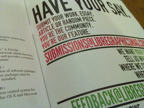
It's not up on the Libre Graphics magazine site yet, but it will be soon. In the mean time, bask in the insiderness of seeing this call for submissions on its first day in the wild.

Libre Graphics magazine issue 1.2: Use Cases and Affordances

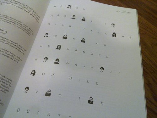
Use cases, at their core, are about the way users proceed through a system in order to achieve an outcome. Normally, there are lots of diagrams and small details involved in creating a use case. But we're not here to go over technical detail. Instead, we're here to talk about that core, the idea of looking at paths of use and interaction.

Then there are affordances, the features of a thing, its possibilities, the ways in which it might come to be used.

Clearly, then, we're talking about the way things are used and, more specifically, the way things are designed to be used.

As designers, artists, makers, builders, we make things that are of use, in one way or another. At the same time, we make use of the productions of others. We do both of those things on an almost constant basis, in our lives, our vocations, our work.

A graphic designer may design a poster that serves the use of informing viewers about that which it promotes. That same designer uses a set of tools, however diverse, to fashion the poster. Thus, the builder is built for. Both the poster and the tools of the designer have affordances and potential use cases. What, after all, is the proper use of a poster? Is it to be read? Is it to be attractive? Is it to be taken off the wall and folded into a paper airplane?

Our software tools, in their affordances and potential use cases, define for us, to a certain extent, what we may and may not do. Those decisions are put in place by the people who design the tools. Together, as users, developers and all areas between the two extremes, we boil in a constantly reconfiguring sea of use possibilities, material and mental affordances.

Which is why, in issue 1.2 of Libre Graphics magazine, we're looking at the interconnecting topics of use cases and affordances. We can look at it from a technical perspective but, perhaps more productively, we can also look at it philosophically. It's about the idea of the affordances of the work, who it's for, what it can do.
That applies both to the work designers do for others and also to the work of others, as it is employed by designers.

Use, mis-use and happy accidents are all areas to be discussed and explored. We're talking, this time around, about all these things. And we want your contributions.

Libre Graphics magazine is seeking submissions for issue 1.2, Use Cases and Affordances. We want your written or visual work, created with Free/Libre Open Source tools, methods and standards. Flip through issue 1.1 to see what we've done in past, then propose to do it again, or better, or to do something else entirely.

Submissions to submissions@libregraphicsmag.com
Submissions for this issue are due by 11:59PM EST, 15 January, 2011
I am so very delighted right now. Last night, I picked up half the print run of Libre Graphics magazine issue 1.1. And it looks amazing. Here, for your enjoyment, are some photos of Libre Graphics magazine 1.1 in all its heavy paper, matte finish glory. And if I may say so, I think it looks pretty beautiful. (If you want to order one, click here.)

20101212_010.jpg
20101212_012.jpg
20101212_015.jpg
20101212_033.jpg
20101212_041.jpg
20101212_050.jpg
20101212_081.jpg
20101212_094.jpg

How can this owl look more heroic?

| No Comments | No TrackBacks
Here's a rather lovely picture of an owl, taken by Wikipedian Adam Kumiszcza.
 Strix_alucoByAdamKumiszczaCCBYSA.jpg

I think it looks pretty heroic from the outset. But I'm wondering if it can be made to look even more heroic. To that end, I've started experimenting with, first, taking the colour out. Like so.

heroicowl.png
But it looks a bit like the tacky wildlife shirts that people buy on their holidays. So I thought that cropping it might add to the heroic look.

closeheroicowl.png
The cropping makes it look a little more heroic, but it still lacks the fundamental propaganda poster look that I want. So I decided, as an intermediary measure, to do a little autotracing.

heroicowls.png
This resulted in a triptych of semi-heroic owls. I do, however, think that I'll need to go all-out and actually do a properly drawn version of it, to get that nice, simple propaganda poster look. I'll report back with the results.

On my introduction to tech

| No Comments | No TrackBacks
The following is the introductory couple pages of a monster paper I'm just finishing up about tech education for girls and young women and how educational gaming might offer a way forward. This little bit includes a rehashing of my oft cited introduction to vectors, as well as some other thoughts about how I learned to be comfortable with technology.

With the firm understanding that anecdote is not evidence, I'd like to introduce this paper with a short series of interlocking anecdotes about my childhood experience of technology and mathematics.

When I was young, I can't quite remember just how young, I learned to type using video games. Some time in the early 90s, Super Mario and Mavis Beacon taught me to type. This was at home, on a 386 computer which was housed in my room. That part alone is a little atypical. Convention tends to dictate that if one child in the family is going to have constant, in-room access to the computer, it's the son. So I learned to type at quite a young age, with the aid of fictional characters and games.

My brother didn't learn to type the same way. Mario didn't seem to help much and Mavis not at all. My brother, instead, learned to type in the early 2000s, when he began to use instant messaging applications to talk to his friends. The necessity of typing quickly, in order to keep up the flow of conversation, taught him to type.

All along, we had the same tools, but our paths of learning differed drastically.

In the mid 80s, when my brother was quite young and before I was even born, he spent hours and hours in the nearby corner store, playing the big arcade games they had. He stood on a milk crate. Our mother, to this day, maintains that it was those hours of video gaming that developed my brother's hand-eye coordination skills.

We were lucky. My father, in the early 90s, quit his government job and instead became a high school tech teacher at a technically focused Catholic school. They had the best toys. My seminal experience, though, was not with those big, hardware-oriented toys. For me, it was in front of that old computer in my room. There are two lessons that stand out. One day, my father introduced me to programming with QBasic. He explained how we could write code to place geometric objects on the screen. The practical takeaway from this, very fitting for a quite young child, was the combination of circles and lines to create a winking cat face. Round face, pointy ears and circular eyes, one of which alternated with a horizontal line to give the impression of winking.

The other seminal experience, one which I still talk and write about to this day, was my introduction to vector graphics. In CorelDRAW 3.0, we opened a clip art silhouette of a horse. Using the node selection tool, my father showed me how to select the point on top of the ear, extend it and turn the horse into a unicorn.

Neither of these experiences was directly game related. What they were, though, were potent explorations of the practical realities of technology and mathematics. That winking cat not only introduced me to QBasic and programming in general, but also to Cartesian space, which has been undoubtedly the most useful mathematical concept I've ever learned. The winking cat program taught me how to practically apply Cartesian space a good seven years before my math teacher ever expressed the x and y axes as "walking to the tree, then climbing it."

These explorations, practical, small and rewarding, have been seminal experiences for me. I was, as I said, lucky. Most girls do not grow up being given practical, exploratory and exciting experiences with math, science and technology. Most girls get their first real experience in the classroom, an environment which prizes rote learning and understanding of theory over practice and problem solving.

A new wash: communitywash

| 1 Comment | No TrackBacks
Tonight's discussion with my fine colleague Colin is turning out some delightful new terminology. To go with the bottom-up creative production I mentioned earlier, here's another one: communitywashing.

We currently seem to love the word "social." We tend to call many things social, even if they aren't necessarily. And we assume that sociality is something practised in communities. Which means that we make some pretty bad classification mistakes.

Two examples: An angsty poem written by one person and then posted on Facebook for the viewing pleasure of the author's friends is not a social production. It is an individual production, from the tortured creative soul of one author. While it is available for the consumption and comment of a community (as long as the author has Facebook friends), it is not community content. Ditto the more involved example of (most) fan fiction. While the work is generally situated within a community of interest (whether that be fans of Star Trek, Harry Potter or Twilight), it is, once again, not a production of that community, merely an artefact of the community produced by one of its members. There is (generally) no communal creation involved.

And yet we tend to think of this stuff as community content. Which is a little irritating to pedants who like to see things properly classified (like me!). Naturally, this new word of mine (I'm calling it mine because I've spotted it only twice in the wild already, with the assistance of our good friend Google) exists to call out such problematic classifications.

You are engaging in communitywashing when you attribute the idea of community production to something that has been produced on a community-focused platform, but which has not been produced communally. If it's the work of one person, it's not community produced. This means that the majority of Wikipedia entries are community production, whereas the majority of blog posts, Facebook notes, tweets or similar largely solitary bits of output are not. And if they're referred to in such a way, then what we have on our hands is, you guessed it! A case of communitywashing.

Pedantry satisfied.

Top-down and bottom-up creative production

| No Comments | 1 TrackBack
In my teen years, when I was a fine young socialist, I used to attend a socialist reading group. It was there that I read the Communist Manifesto. It was there that I learned the difference between top-down and bottom-up.

Fast forward. Today, in discussing the issue of terminology, I've decided that there's an exciting new use for the word "bottom-up." There's a problematic set of words used today in the area of digital creative production. We've used the term "user generated content," which implies that users are a lesser species of producer. We've used the term "social content," which implies that all results of such production are either produced socially or with an overtly social intent.

I'm now thinking that it makes very good sense to advance the term "bottom-up production." This term carries some different connotations to the other two mentioned above. Instead of creating a difference between user and creator, it merely implies a difference in power. A bottom-up creator is one who does not wield traditional trappings of creative power. She may not be professionally classified as a writer/designer/musician/director/whatever, she may not earn a living from her work or be employed in a creative capacity. This does not mean that we need to refer to her simply as a user. The term user renders her passive. It implies that someone else is the creator and that the production of the user is not real creation.

Thus, the term bottom-up production lends a different sort of connotation. It does not make judgements on the ability or classification of the producer, merely on the sort of power and position she wields. She is not a passive user. She is, instead, an active creator, merely one who happens to be operating from a place of potentially marginal power. But that doesn't mean that her output will be any less valid or good. In fact, the work of bottom-up creative producers may just have the agility and perspective to be far more interesting than that of top-down creative producers.

How does ginger write?

| No Comments | No TrackBacks
Lately, I've been writing a lot of things that are meant to be both persuasive and reasonably factual. In writing these things, I've gotten to thinking about how it is that I write them. Below, an outline of what is, for me, a pretty normal writing process.

1. Sit down and type. Spit something out. This step is normally in the form of a "once upon a time," a manifesto or something argumentative and strong, but kind of messy.

2. Take the result of step one. Ditch any extraneous bits and pieces like "once upon a time" or bits that are obviously self-reflective like "what am I writing?"

3. Take the result of step two. Go through it, isolating ideas. Make it look like poetry. More to the point, turn it into discrete units. This means that each individual idea or portion of an idea gets its own line. Eventually, the piece does indeed look a little like poetry, in that it has a whole series of things in short units lined up one after the other, organized by general topic in stanzas.

4. Take a step back. Figure out what the purpose of the piece is and, indeed, what its structure should look like. Draw up an outline reflecting that purpose and structure.

5. Look at the outline, look at the itemized piece of writing. Grab bits from the itemized piece and fit them into the appropriate places in the outline.

6. Once ideas are in place, read through the filled-in outline. Edit it aggressively.

7. Repeat step six again, as many times as needed until it feels finished, whatever that means.